
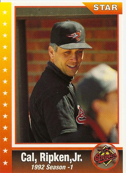
1. The photo negative is reversed. Note the script on Cal's jersey, and the turned-around bird.
2. There should not be a comma after "Cal".
3. There should be a space between the second comma and "Jr".
4. Ideally you would avoid a picture with a blurry half-a-head in the foreground...especially when it looks like the Iron Man is checking out that person's rear end.
5. I would copy-edit the back of the card, but the first sentence features the following apostrophe abuse - "Oriole's". Ugh. I'm done.

4 comments:
Also the fact that, according to most styles, there shouldn't be a comma before Jr. What an atrocious card!
LOL I remember that Star company. I'm not surprised at how awful that card is. They used the same pic on a 'promo' card or that 80 card Ripken set. Only $18 on eBay!!
Dan - It's so bad, it's almost good. Almost. The apostrophe thing is a chief grammar pet peeve for me.
Bob - Nice find! At least they had the negative facing the right way on that one.
One of the ugliest Cal cards that I've ever seen!
Post a Comment